2020 Paint Color Trends
It’s a new year and a new decade!! Let’s take a look at what the major paint brands are predicting the 2020 paint color trends will be!
It’s a pretty exciting time for us interior design nerds (*raises hand*) because it predicts some of what the 2020 paint color trends will look like for the coming year.
Did you know that every year all the major paint brands come out with a “Color of the Year”?
And, this year is extra special because it’s a new decade. Think back to what the colors were in the 80s or 90s. Even the gross beige of the 2000s.
If you need help choosing a paint color, be sure to check out my Ultimate Guide to Popular Paint Colors!
Get Inspired by these 2020 Paint Color Trends
You’ve heard me talk about it before (a million times) but choosing a new paint color is the quickest, easiest, and cheapest way to transform your home. Plus, it has the added bonus of not being permanent.
I’m not afraid to change paint colors after I realize I don’t really like them. You’re not signing a long-term paint contract in blood. It’s ok to change it up 😉
So, painting is the easiest way to stay on top of design trends.
The colors of the year for 2020 range from blush pink to dark blue to pale green. A lot of these companies give color palettes for the entire year along with their color of the year.
I’d love to hear what you think about these colors!
1. First Light by Benjamin Moore
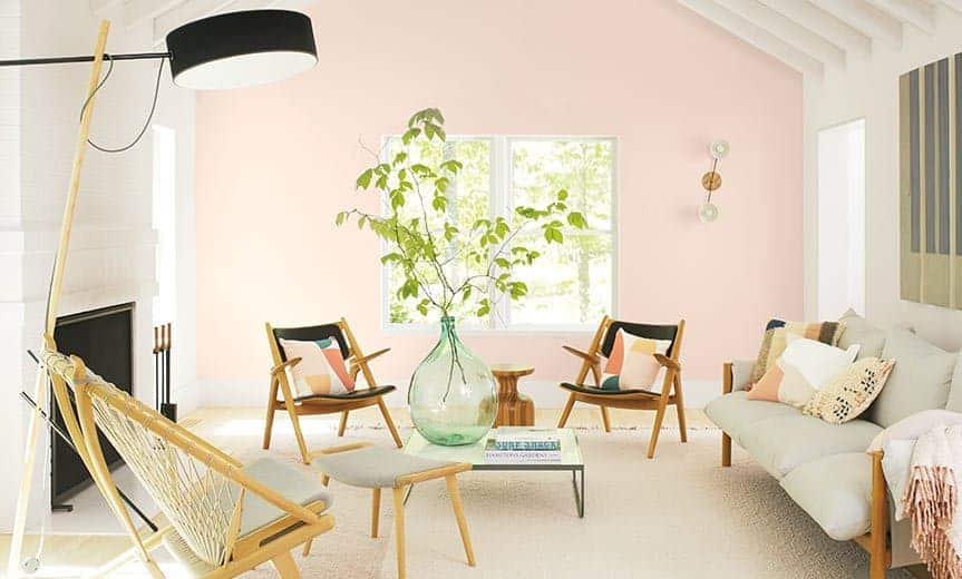
Photo Credit: Benjamin Moore
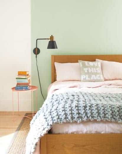
Kicking it off with a super light and airy pink is Benjamin Moore. I was really surprised by all the rosy pinks on many of the brands’ 2020 color palettes. I think this color is pretty overall but I can’t imagine using it in our house, other than maybe in one of the girl’s rooms.
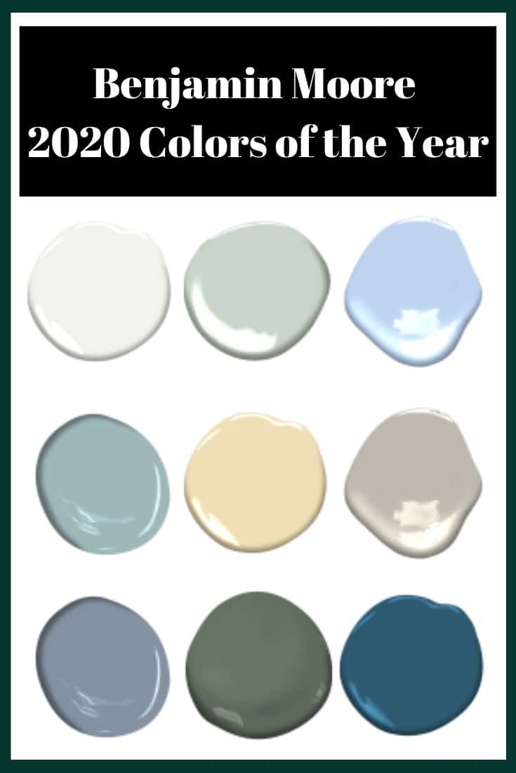
First Row : White Heron, Crystalline, Windmill Wings
Second Row: Buxton Blue, Golden Straw, Thunder
Third Row: Cushing Green, Oxford Gray, Blue Danube
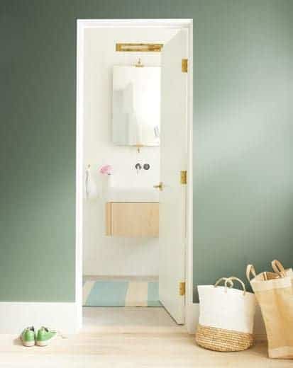
I’m really loving the greens in this palette. But, then again, I’m really drawn to greens in general. I’ve noticed an overall lightening in their 2020 color trends. I still think dark paint is going to be on trend this year – and I plan to use a lot of it!
2. Naval by Sherwin-Williams
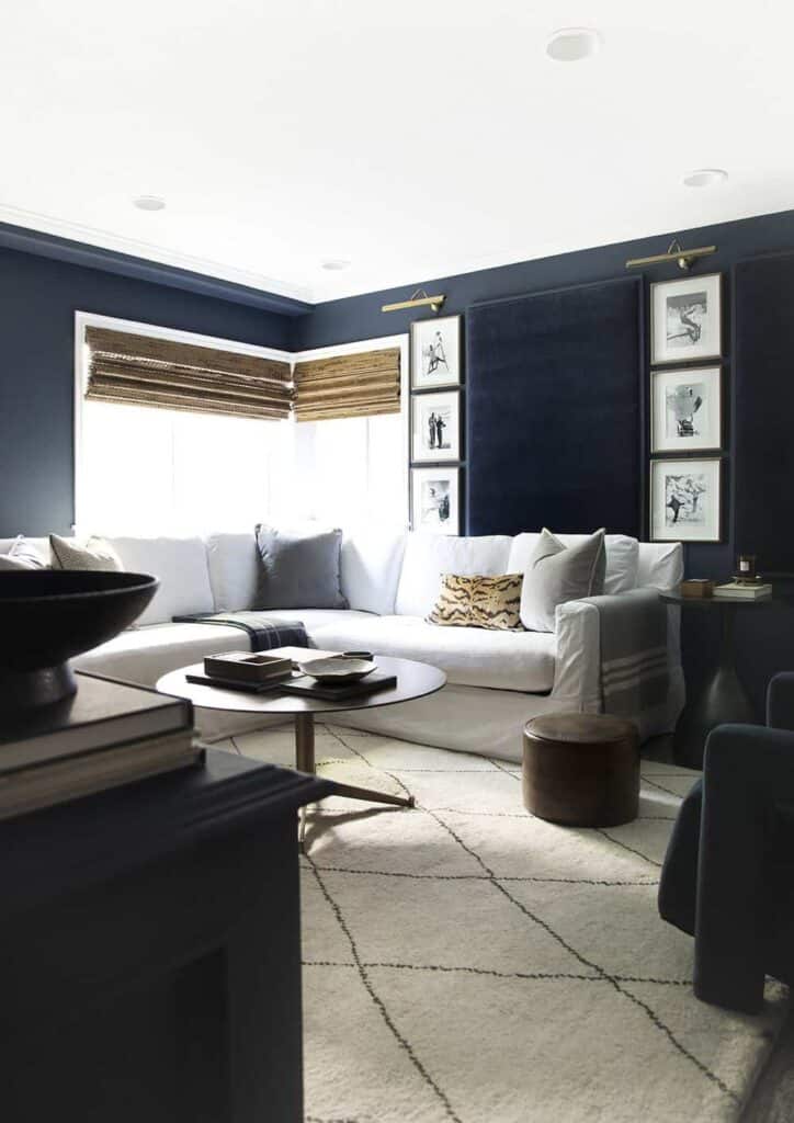
Sherwin-Williams describes Naval as a “rich navy that creates a calm and grounding environment infused with quiet confidence”. I couldn’t agree more! That’s why it definitely belongs in this list of the most popular Sherwin-Williams paint colors.
While I tend to be more of a green paint lover these days, I can’t get enough of dark, moody blues. I’m a huge fan of this color!
3. Back to Nature by Behr
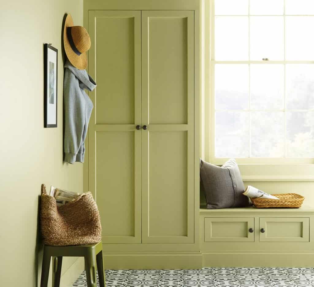
Photo Credit: Behr
I have to say I’m intrigued by this color. I don’t hate it but I don’t love it.
In some pictures, it appears to be almost neon, and in others, it looks a lot more subdued. If you want to try this one out, I suggest getting a sample first.
Behr says Back to Nature “perfectly captures the essence of subtle and effortless green that can be found in a wilderness landscape or an indoor garden.”
While I’m not convinced on Back to Nature, I LOVE the overall aesthetic of their 2020 color palette. The description of their color palette says it was inspired by natural elements such as sky, earth, water, and plant life. I’m all about that first color there – Cider Spice and the really pale blue in the middle of the bottom row – Light Drizzle.
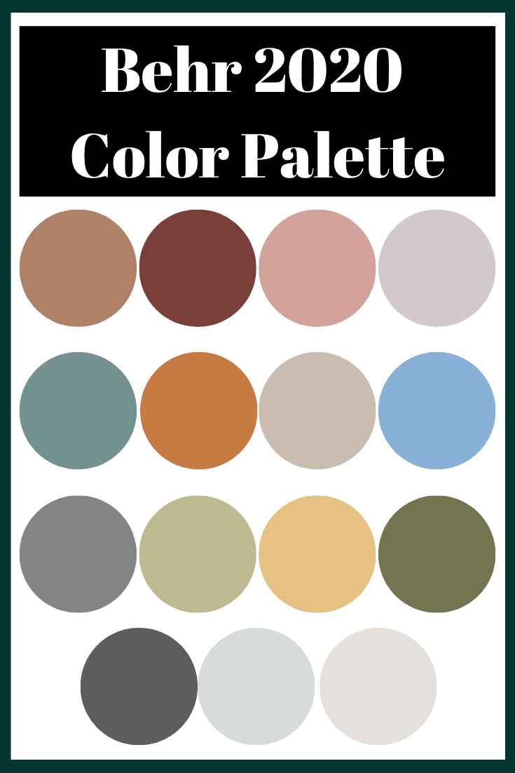
First Row: Cider Spice, Red Pepper, Bubble Shell, Dusty Lilac
Second Row: Dragonfly, Rumba Orange, Creamy Mushroom, Bluebird
Third Row: Battleship Gray, Back to Nature, Charismatic, Secret Meadow
Fourth Row: Graphic Charcoal, Light Drizzle, Painter’s White
4. Romance by HGTV Home by Sherwin-Williams
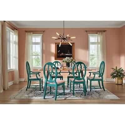
Photo Credit: Lowes
We’re back to blush pink tones for HGTV Home by Sherwin-Williams color of the year. They describe it as a posh blush pink saying “Romance captures the balance of optimism and calmness we desire at home”.
I feel like all of their colors look like you’re on vacation. I picture a beachfront home, crystal clear water, and peaceful relaxation. So, nothing like a beach vacation with kids…
I’m really loving their whole color palette! I’m not a huge fan of using beachy colors outright when you’re not on the beach but as a pop of color here and there they’re great!
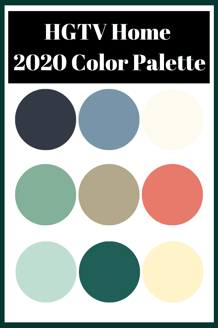
First Row: Blue Endeavor, Finian Blue, Fundamental White
Second Row: Restful, Gristmill Greige, Coral Reef
Third Row: Mint to Be, Island Time, Vanillin
5. Chinese Porcelain by PPG Paints
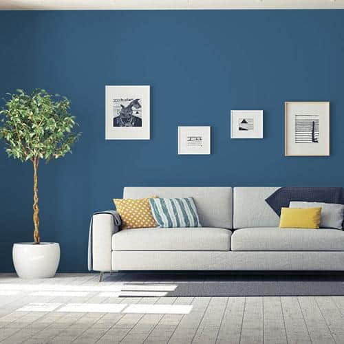
Photo Credit: PPG Paints
PPG says the “shade is a blend of cobalt and moody ink blue that imparts calmness and restful sleep while also offering the spirit of hopefulness – a precious commodity in a restless world”.
All the major paint brands are definitely focusing on calmness, relaxation, meditation, and nature. I don’t really see this color from PPG doing that. Maybe it’s just me. I think it’s a really stark color that would only fit a handful of rooms. And, I can’t imagine using it anywhere in my house.
6. Classic Blue by Pantone

Image Source: Pantone
If you aren’t a designer or design blogger, you probably don’t know who Pantone is. Pantone is truly iconic when it comes to choosing the paint color of the year. It’s a highly anticipated event whenever Pantone releases their color of the year.
This color, Classic Blue, is meant to instill “calm, confidence, and connection”. While it’s similar to PPG’s Chinese Porcelain, it has a deeper, moodier tone and I LOVE it.
7. Valspar’s 2020 Paint Color Trends
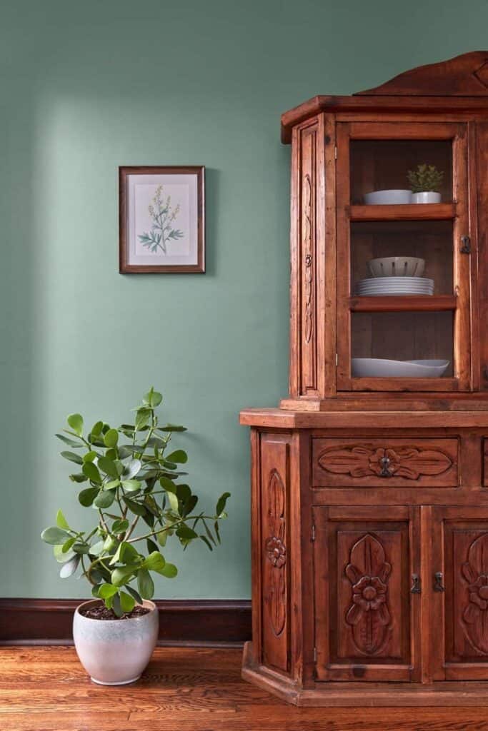
Just to be difficult (*wink*), Valspar doesn’t choose just one color of the year. They choose 12 (!!). I have to admit I don’t think I’ve ever gone to Lowe’s to get paint. But, this color palette has me second-guessing that!
These colors are AMAZING. My favorite is Secluded Garden (pictured above).
According to their press release, Valspar said the palette was, “Earth’s prescription for the chaotic, busy lives we all live is to bring the tranquility of nature and the outdoor world into the home”.
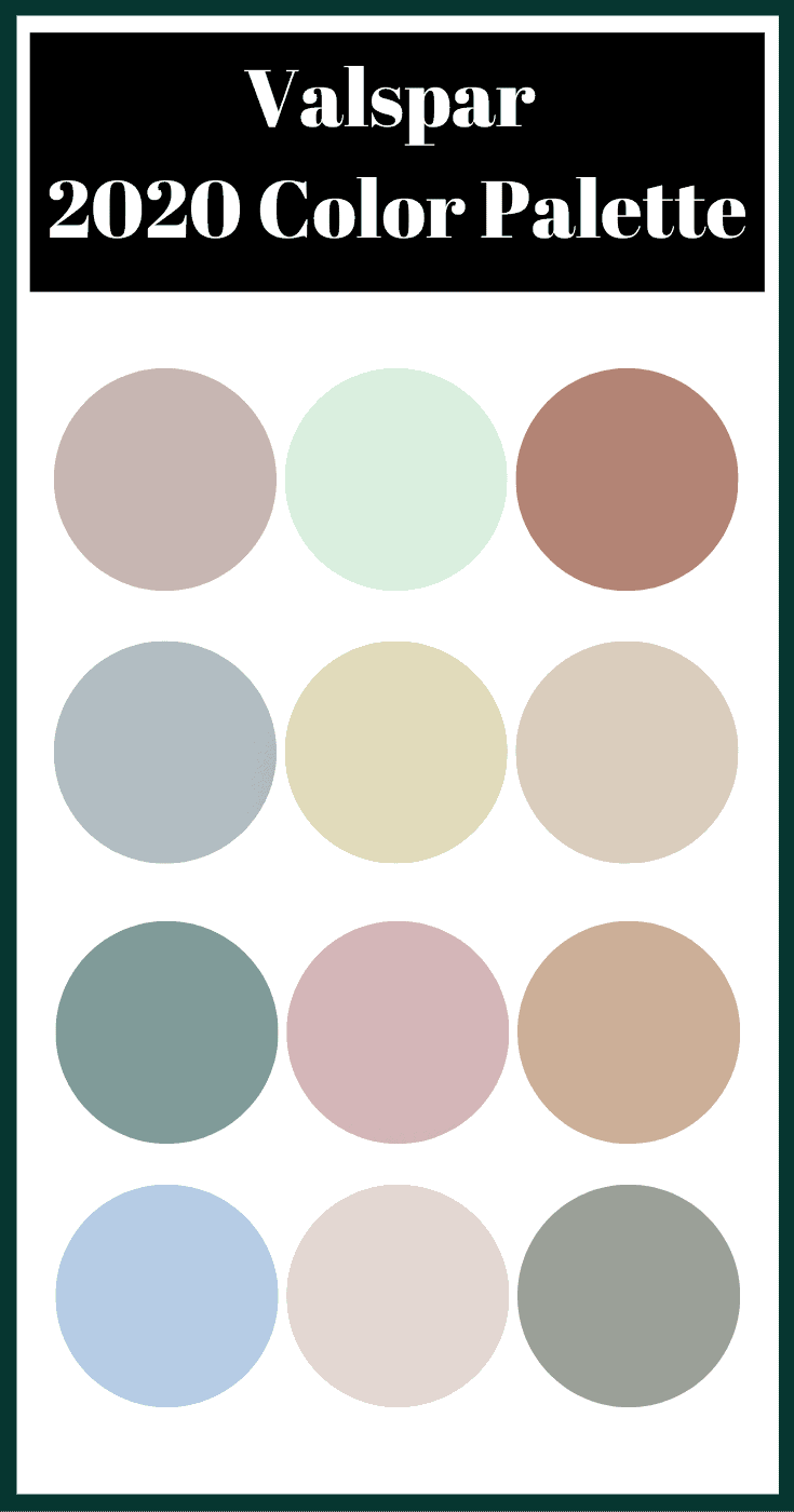
1st Row: Winter Calm, Mint Whisper, Canyon Earth
2nd Row: Grey Brook, Tempered Sage, Desert Fortress
3rd Row: Secluded Garden, Bombay Pink, Pale Powder
4th Row: Utterly Blue, Crushed Out, Secret Moss
If you need help choosing a paint color, be sure to check out my Ultimate Guide to Popular Paint Colors!
My final thoughts on the 2020 paint color trends
A few thoughts….
It doesn’t seem like much is new in these colors. It’s nothing really groundbreaking. Pink has been back for a few years now, as have various shades of navy/blue.
Most companies are trying to focus on nature and calmness. Lots of pastels, lots of blues and green. I’m loving the burnt orange and terracotta vibe from some of the palettes, specifically the Valspar Palette.
That being said, Valspar’s Colors of the Year wins the 2020 paint color trends for me!
Remember, if you’re looking to transform your home or simply give new life to a room, new paint color is the easiest and cheapest way to do that.
