Our Modern and Vintage Master Bathroom Reveal
A perfect mix of modern and vintage styles – this master bathroom reveal is a must-see!
Today I wanted to finally share our master bathroom reveal from our old house.
It was another project in that house that turned out exactly how I had envisioned. I feel like it really fits the home’s 100+ year history and style. It’s modern enough without being too sterile, with plenty of charm that feels like it belongs there.
If you remember, this is what it looked like before. The opening on the left there is the “bathroom.” AKA, closet. AKA, a place where we threw a bunch of stuff that we didn’t know what to do with.
Want to see more of our bathroom renovation? Catch up here:
- Modern Bathroom Mood Board
- Modern Vintage Bathroom Inspiration
- 5 Ways How to Save Money on Bathroom Remodel
- Bathroom Inspiration: Bathroom Vanities Made Out of Old Dressers
- Mixing Metals In The Bathroom
- Simply White by Benjamin Moore Paint Color Overview
- Mount Etna Sherwin Williams Paint Color Review
This post contains affiliate links. Please, click here to read my disclosure policy.
The Modern Vintage Bathroom Makeover: Before Pictures
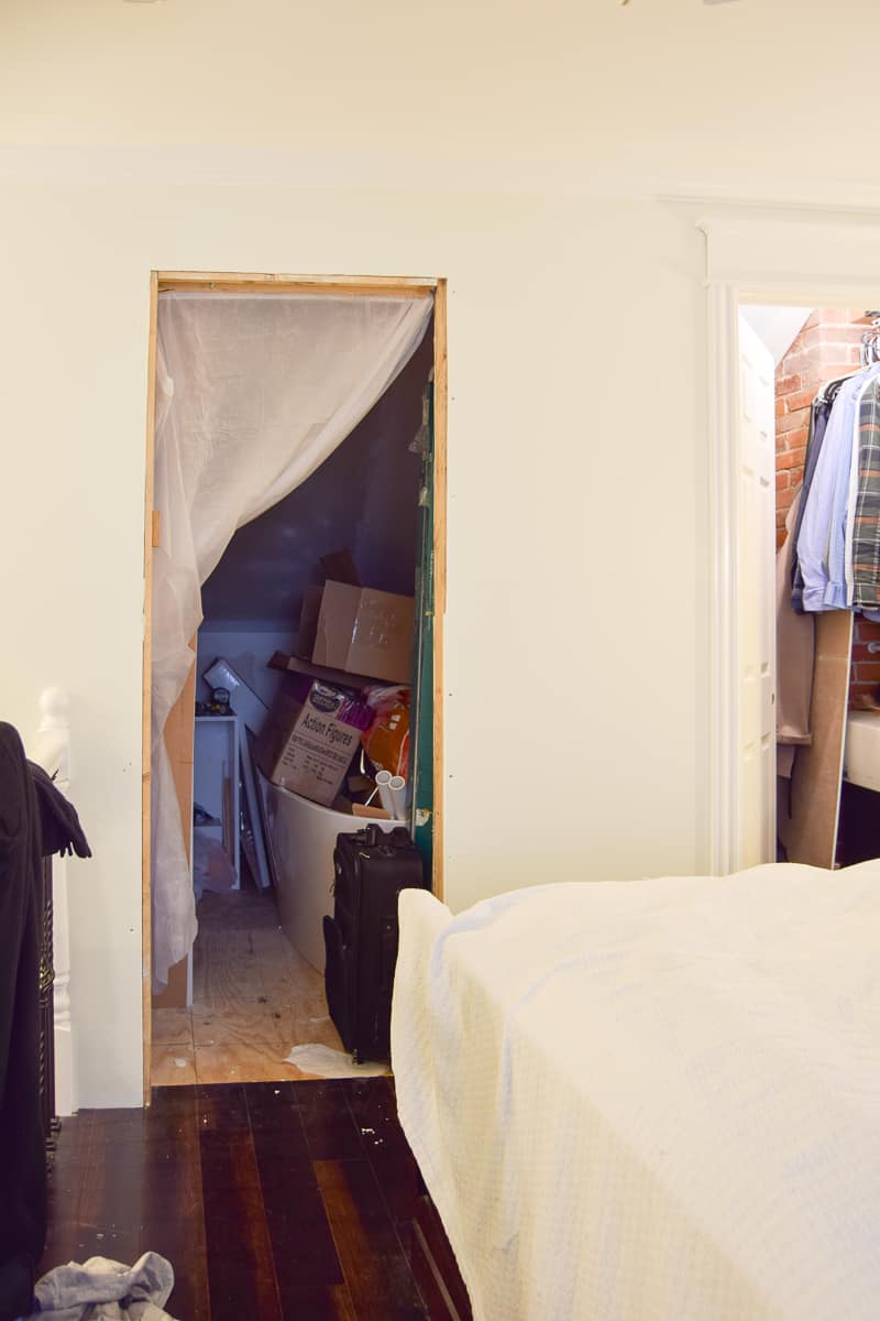
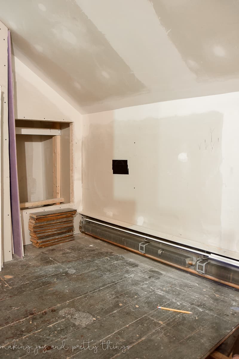
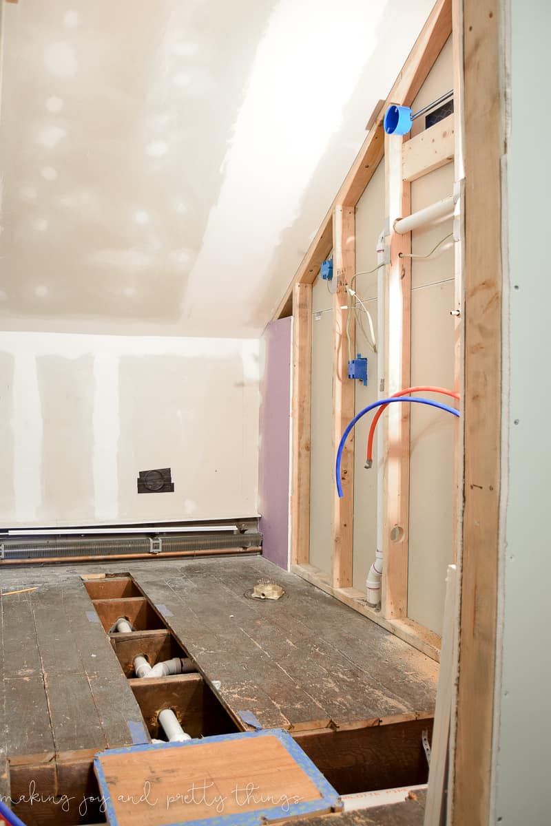
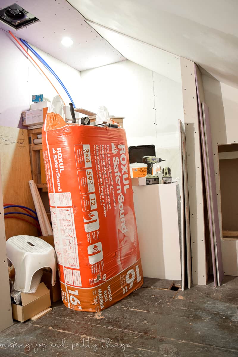
Once we cleared out all the stuff I should have just thrown away precious valuables, this is what we were left with.
Design Inspiration for Our Modern Vintage Bathroom Makeover
I shared all about my design plan for our master bathroom here.
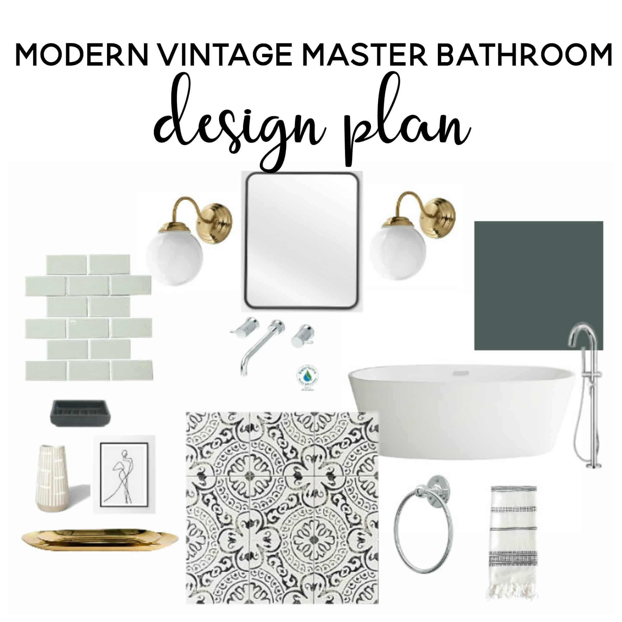
It took forever to finish it (as was the case with every.single.project.ever in that house) but it is seriously perfect.
Note: All sources are linked at the bottom of the post for your convenience! Click here to scroll down to the source links.
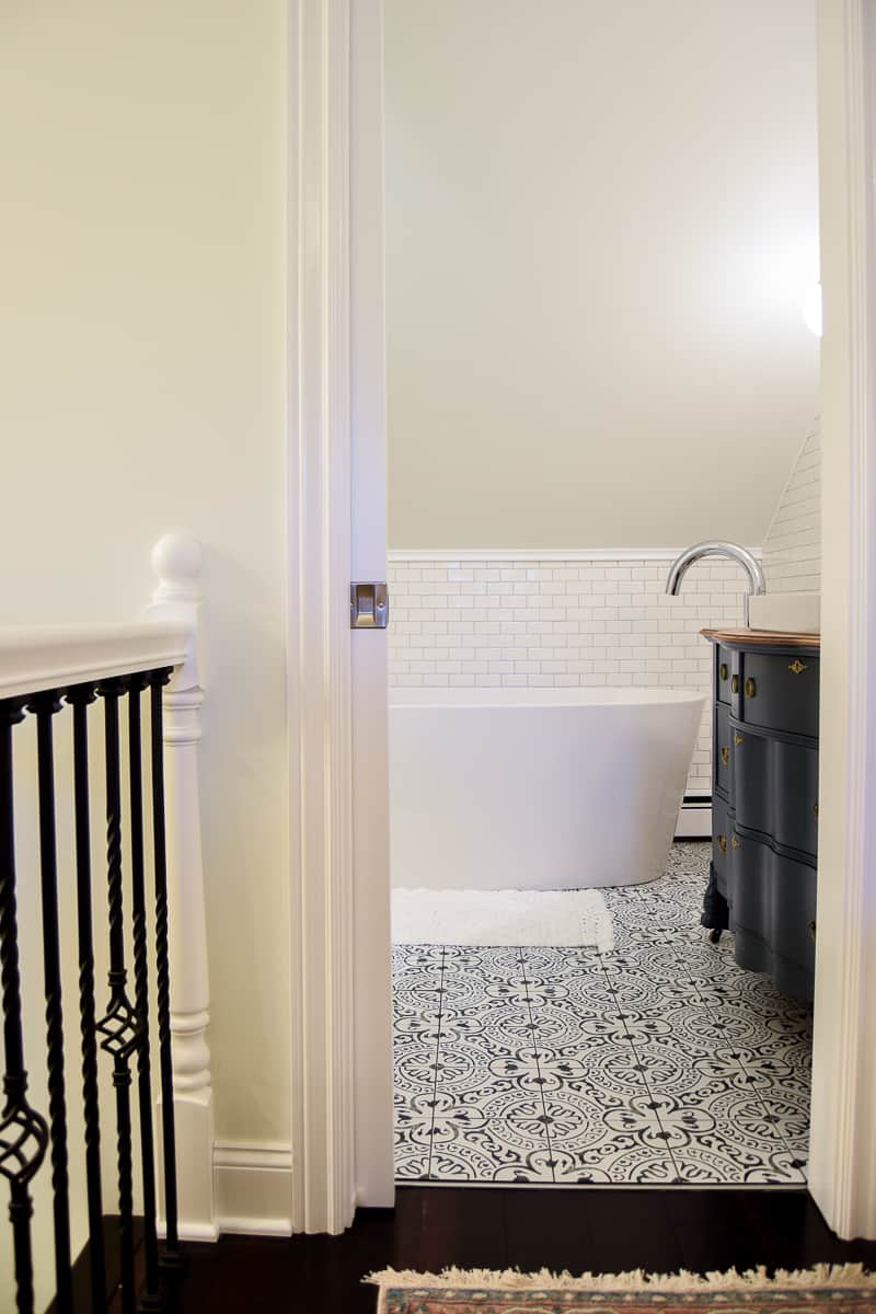
Modern Vintage Bathroom Reveal: After Pictures!
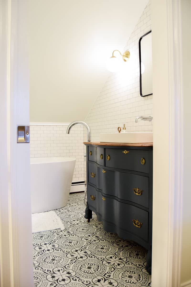
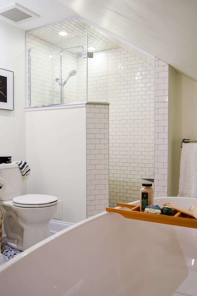
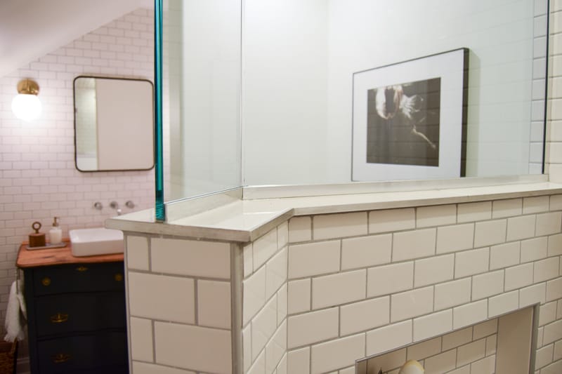
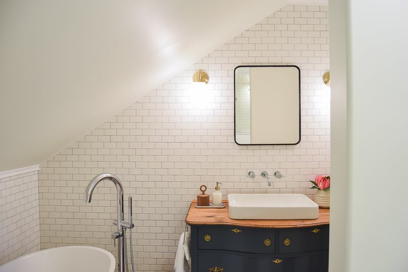
OMG. Love love love love.
I don’t even know where to start! I have a feeling this is going to be a very wordy and picture-heavy post. It was so hard to narrow down the 438 (yes, seriously) pictures I took. So, if you want to skip over my rambling, there are plentyyyy of pictures to look at instead 🙂
Modern Vintage Bathroom Floor Tiles
The whole design plan began around the floor tile that I felt in love with.
I saw it while browsing Wayfair and knew I had to have it. It has a cement tile look without the cement tile price. I think it has a modern look to it (as cement tile is so trendy) but also feels very vintage-y. You could use it in a completely modern room or in an older, “charming” room as well.
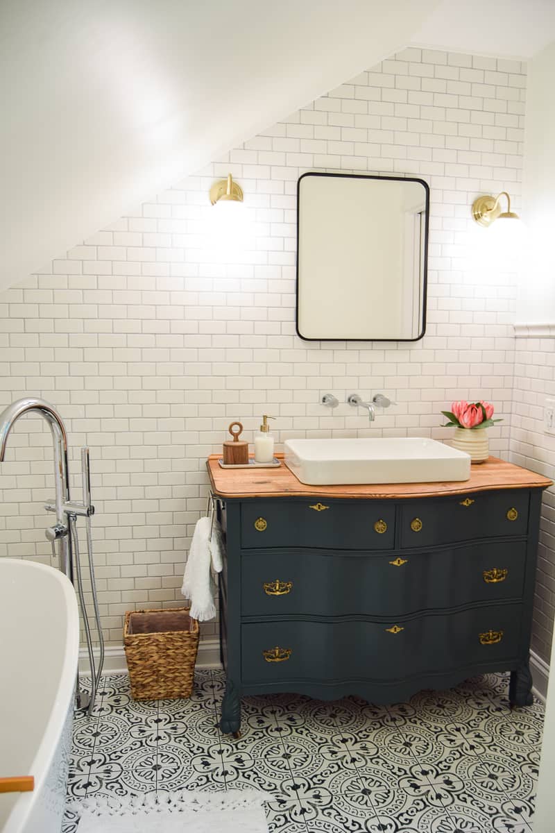
I absolutely LOVE the floor tile. Especially once it was paired with dark grout, the whole design really popped.
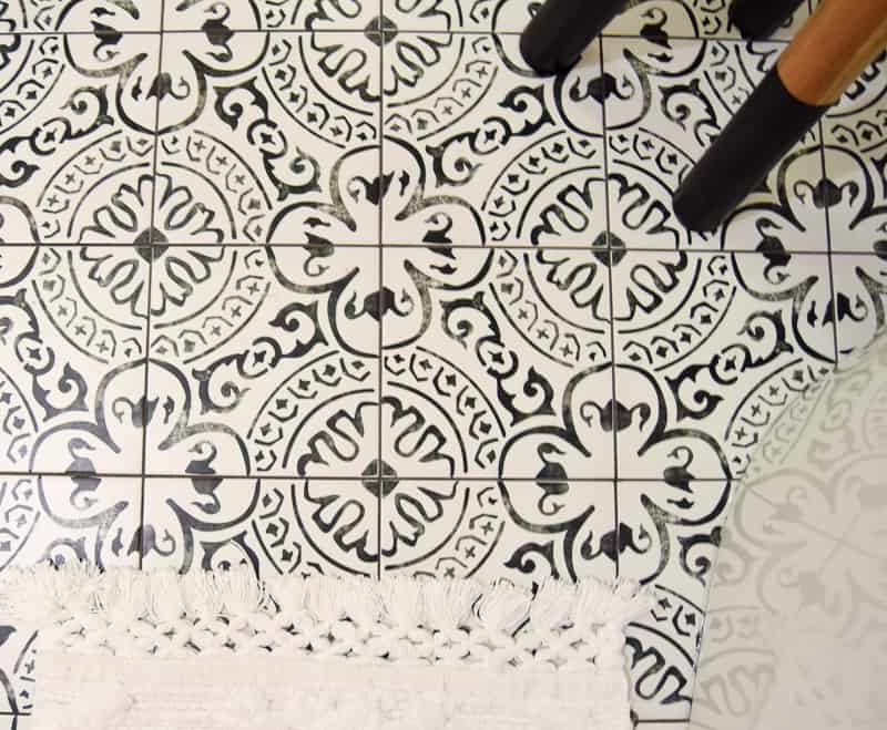
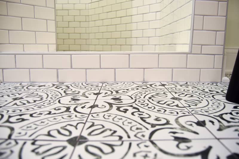
With the floor tile being so busy, I knew I had to keep it relatively subdued in the rest of the room.
I chose a neutral, creamy white paint on the walls and classic white subway tile throughout.
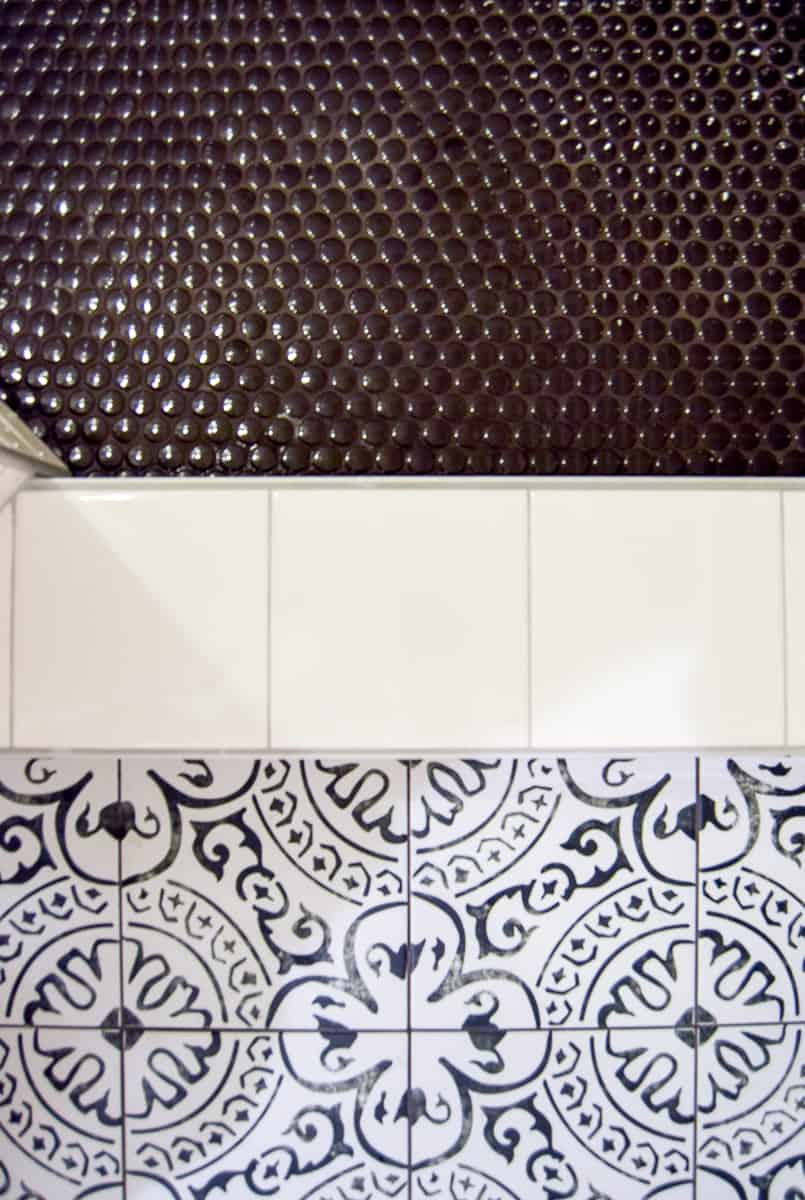
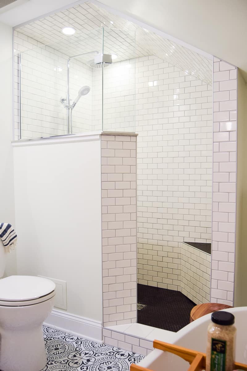
The hardest tile decision was definitely in the shower – the floor and bench top. My initial gut feeling was to go with black penny tile and I’m so happy I did.
It’s a bold choice but I think it compliments the room and other tiles perfectly.
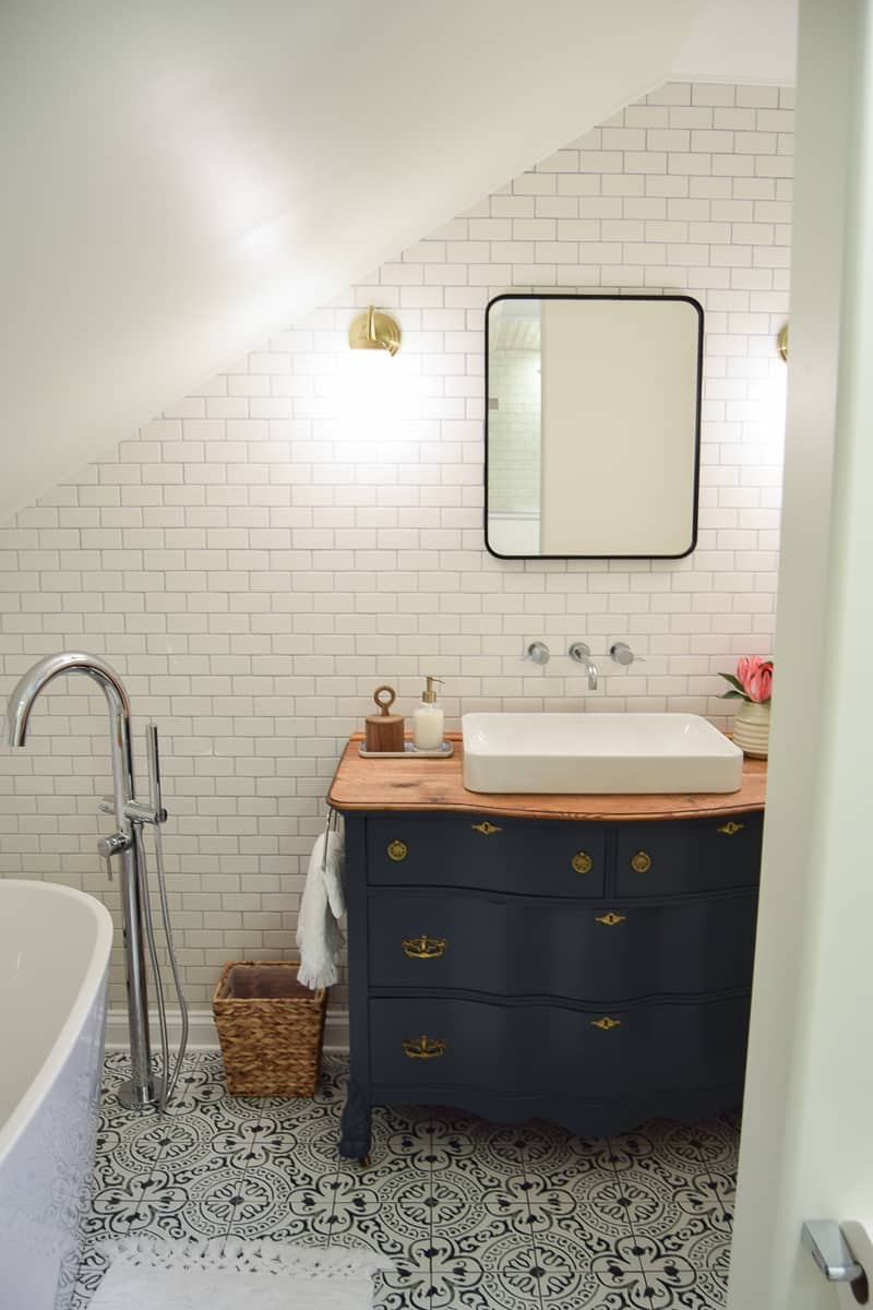
Modern Vintage Bathroom Vanity
With the tile picked, it was time to think about the rest of the bathroom.
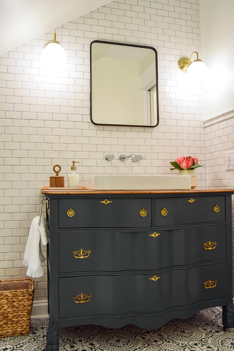
I had my heart set on turning a vintage dresser into a vanity.
When I found the absolute PERFECT dresser for just a few hundred dollars, I bought it that same day. It may have stayed in our basement for months (and months and months) but I’m so glad I made that purchase last fall.
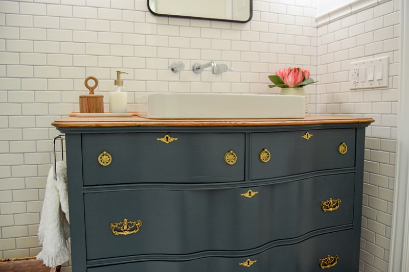
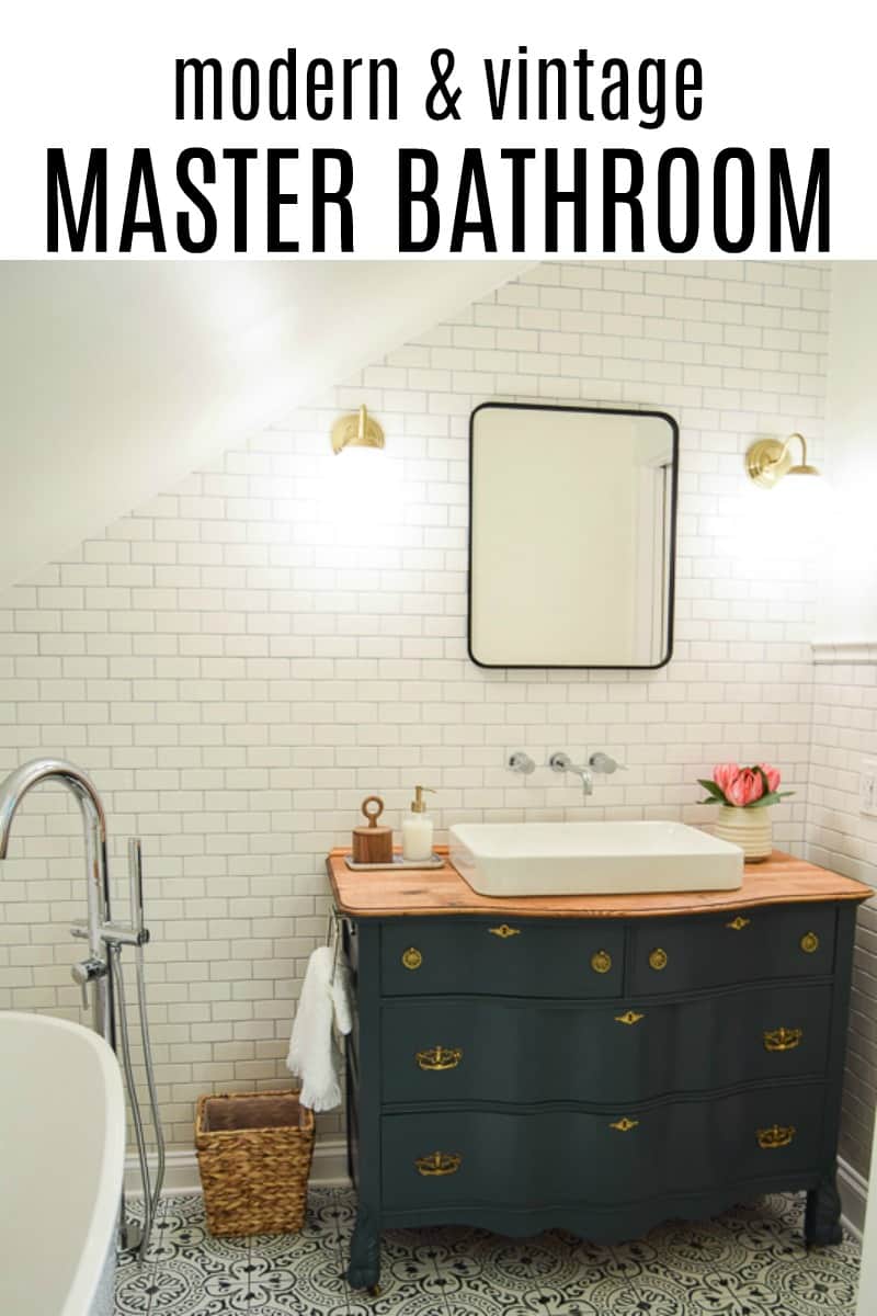
This baby was a lot of work. We sanded down the whole thing, then primed and painted the entire dresser (minus the very top). I chose a dark green (Mount Etna by Sherwin Williams) after buying 10 million samples.
I couldn’t decide between dark green or dark blue. It had to be a dark color since everything else (besides the floor) was white white white. It HAD to stand out without being busy.
I opted for green over blue because I had sooooo much blue in our house that I needed a change. And, apparently, green makes a space feel more tranquil and relaxing. But, mostly that too-much-blue thing.
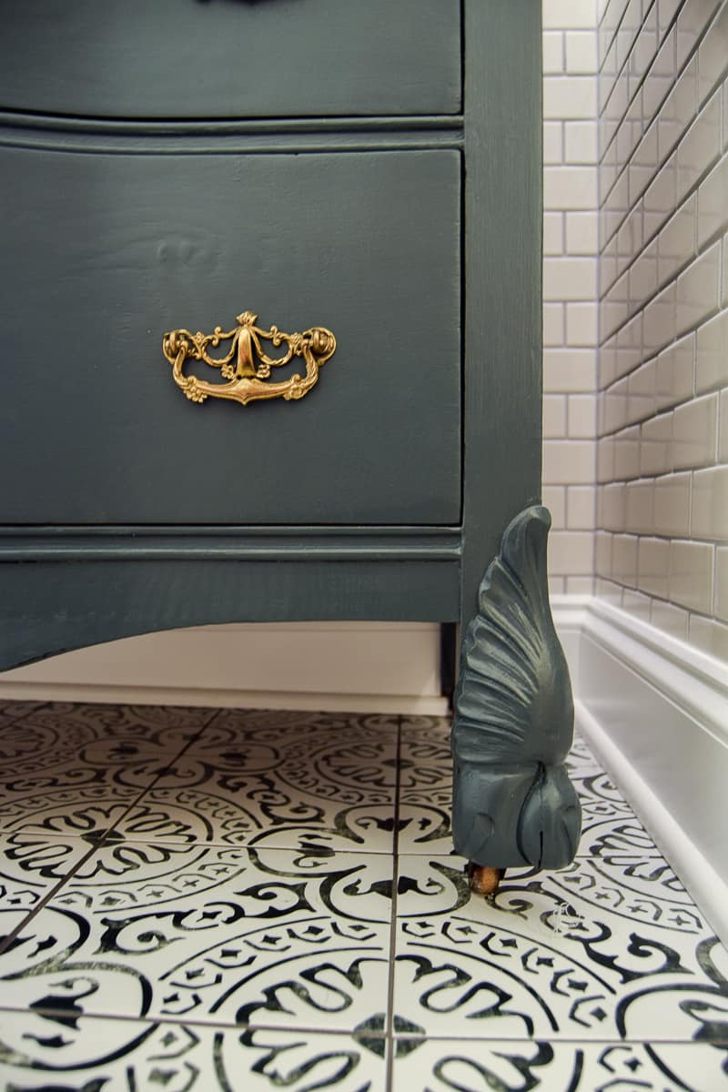
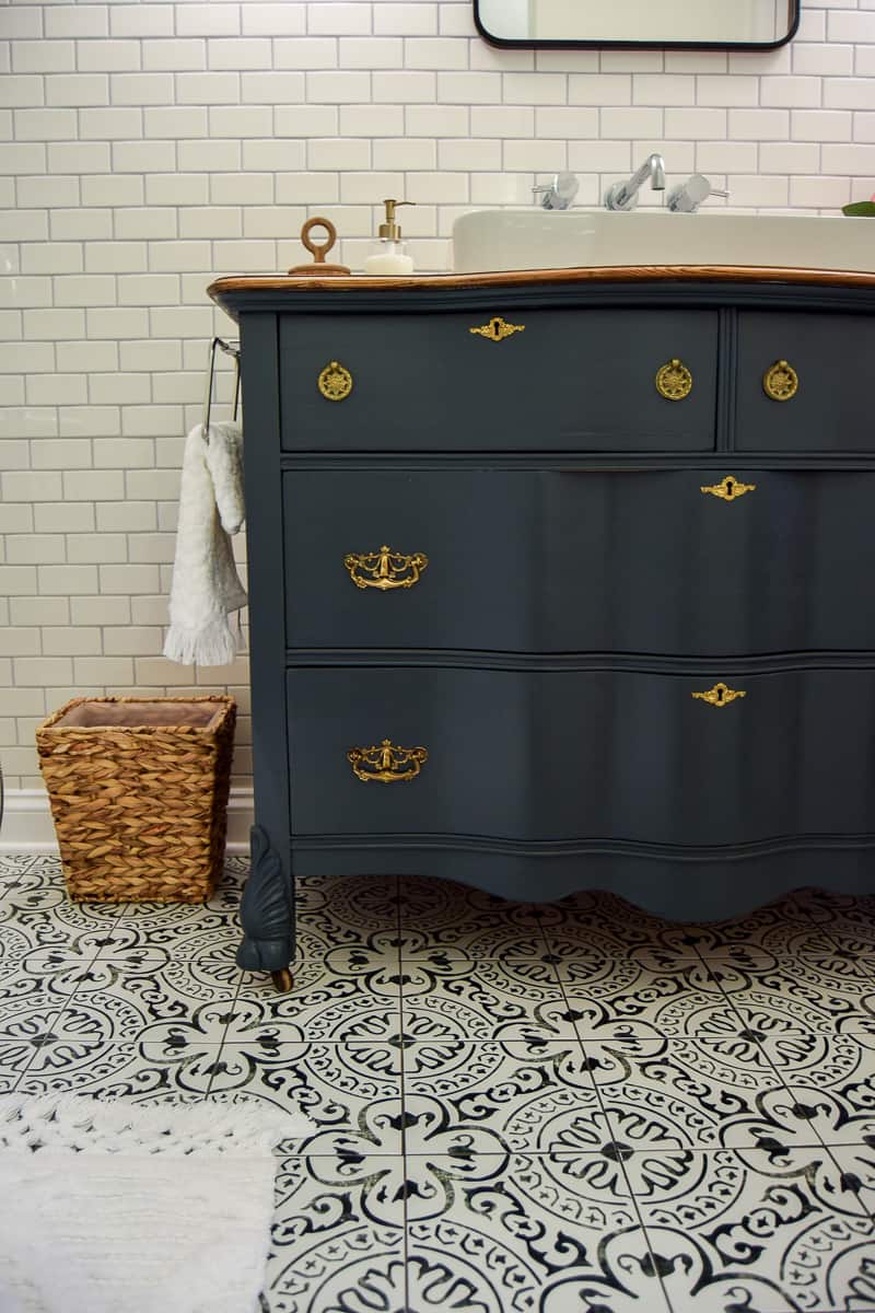
My husband and I didn’t communicate exactly what were going to do for the top. He thought he was supposed to sand the entire thing down, and I just wanted the sides and front sanded.
But, this mistake actually revealed the beautiful wood grain on the vanity top that I decided to keep. We finished it with some oil to seal it, and the grain really pops.
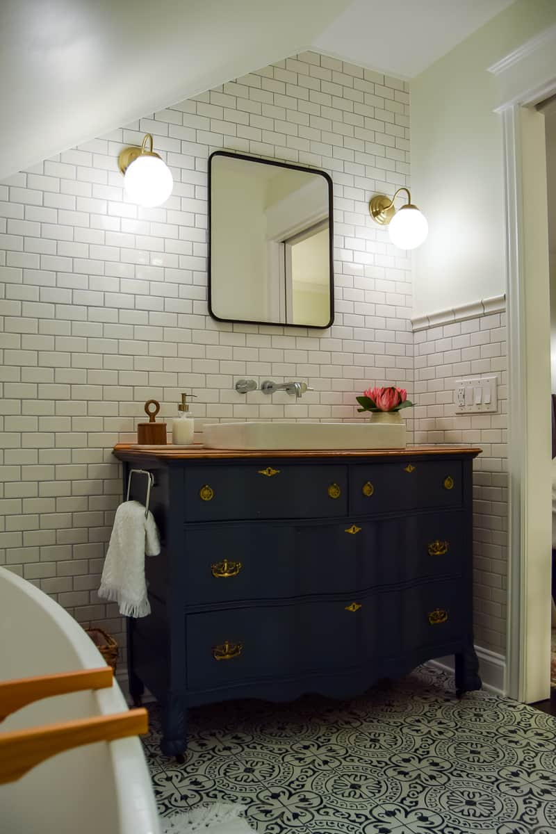
Even though it was a lot of work, it is absolutely perfect in the bathroom. From the wavy wood in the front, to the beautiful details in the legs, to the hardware, to the tiny little wheels on the bottom, sighhhhh, I was head over heels in love with it.
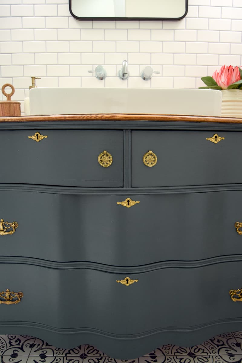
Modern Vintage Bathroom Fixtures: Sink, Faucet, and Wall Sconces
The sink we used came with a template to cut out a hole in the vanity for it. This was surprisingly not as difficult as it sounds. While it’s only a single sink in a master bathroom (GASP!!!) the room wasn’t big enough for a double vanity.
Personally, I’d rather have a single sink with more room on the sides than two sinks and no countertop space.
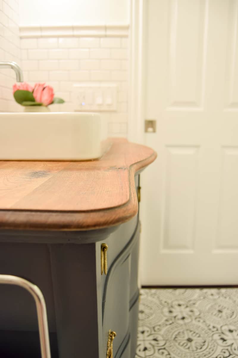
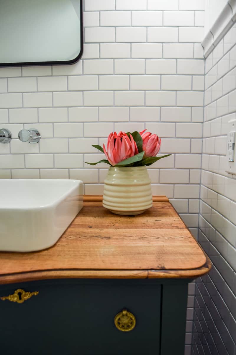
I just loooove the wall-mounted faucet, too!! The perfect modern touch to compliment the modern subway tile and sink.
We opted for a chrome finish for the faucet. Chrome is our main metal for the bathroom.
We used chrome for all fixtures (faucet, tub filler, shower hardware, toilet paper holder, towel bar, and hand towel holder) and brass as an accent metal.
I love the look of mixed metals. It makes the room feel gathered, collected, and eclectic. I wrote a whole post on mixing metals because I love it that much.
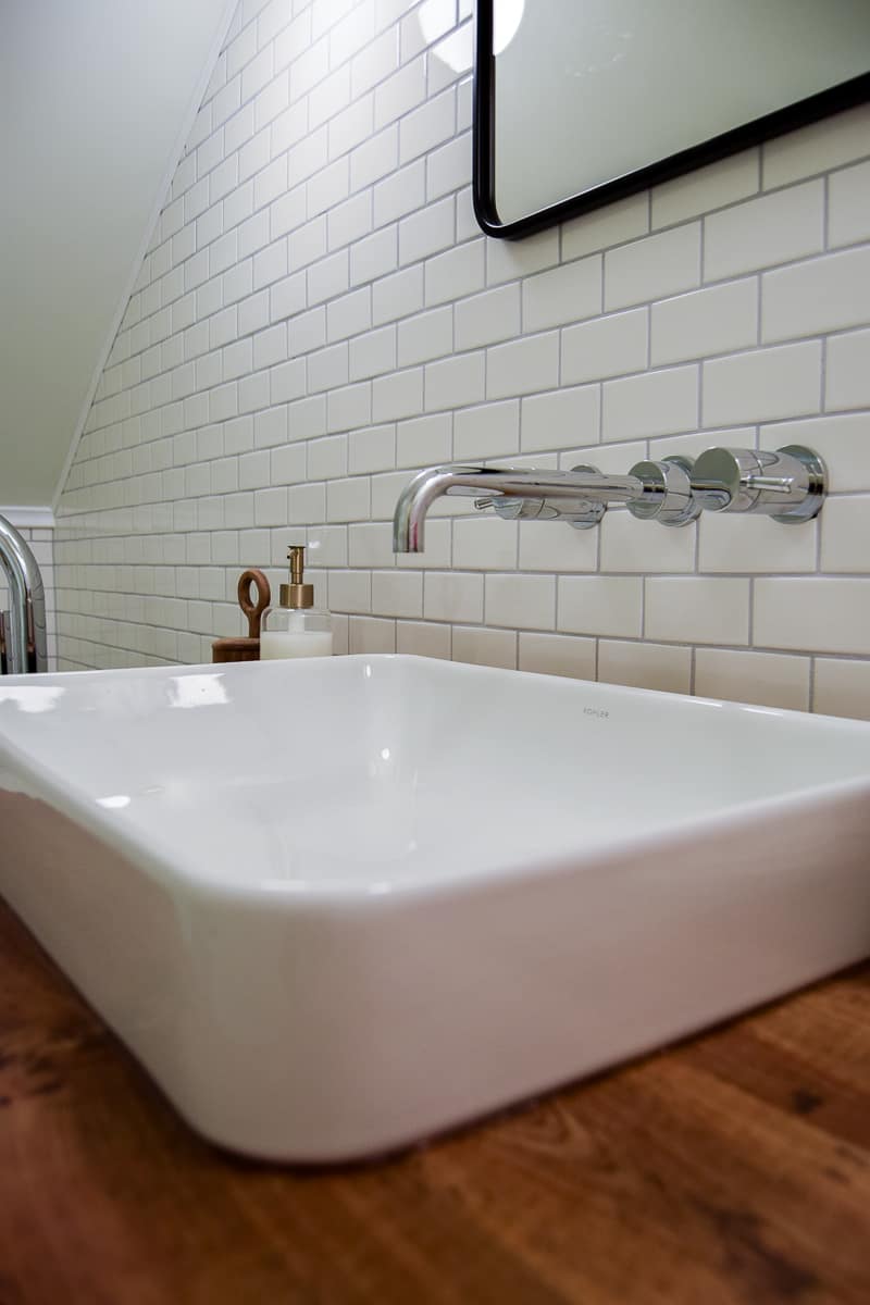
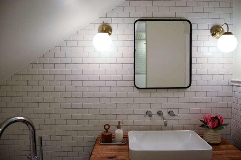
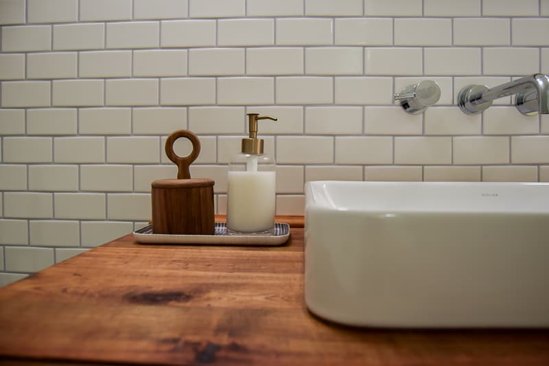
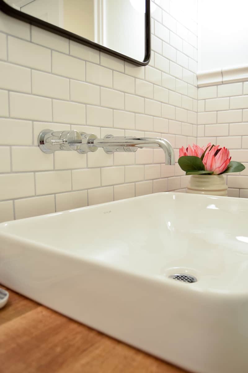
I kept the modern theme going by picking a matte black rounded rectangular mirror. That black really pops next to the tile and is repeated in the floor tile and shower penny tile. I felt like this side of the room needed some black, too.
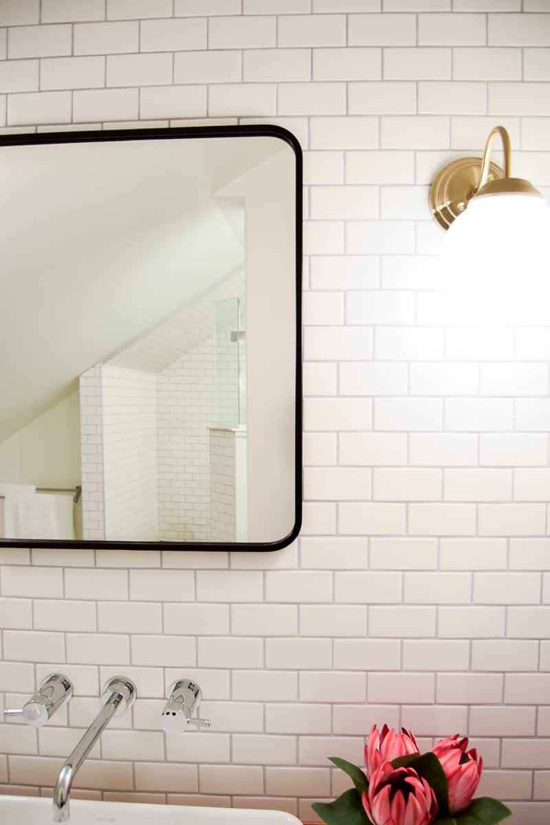
The sconces are brass (my accent color). I couldn’t replace those perfect pulls on the dresser so I needed to make sure the brass was repeated elsewhere.
The sconces and soap dispenser (a more subtle brass) make the dresser hardware feel like they belong in the room. As long as a metal is repeated more than once, I say GO FOR IT! (But seriously, more details in this post about mixing metals)
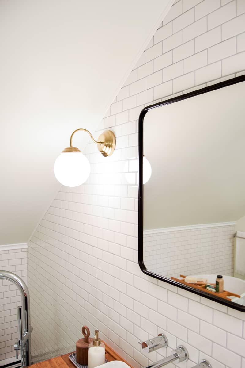
One final look at this part of the room:
Stunning White Porcelain Soaking Bathtub for a Modern Vintage Bathroom
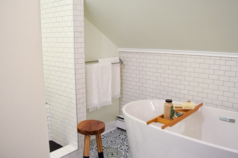
When I saw this bathtub and filler from American Standard, it was love at first site.

It’s the soaking tub to end all soaking tubs. Seriously.
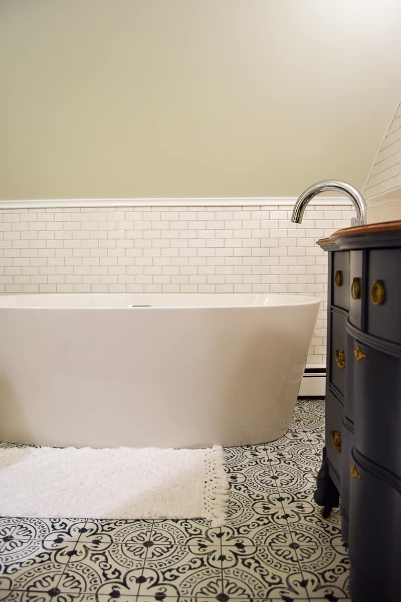
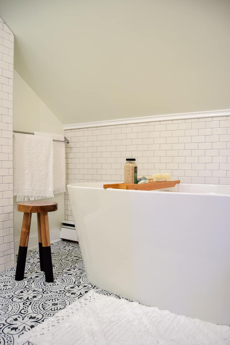
It’s the perfect piece to fill in the awkward space beneath the sloped ceiling.
I think I love the tub filler even more than the tub itself. It’s SOLID, clearly well made. I just love how it looks arching above the tub.
Not only is it pretty and functional, it also has a little attachment that you can pull into the tub.
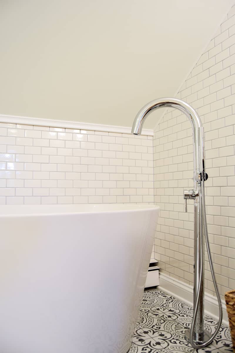
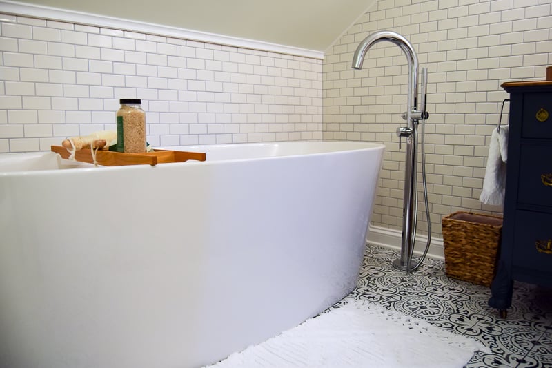
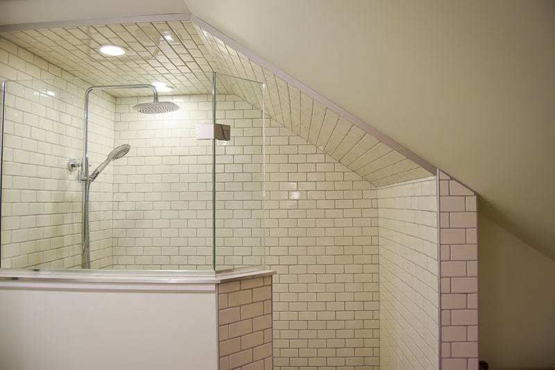
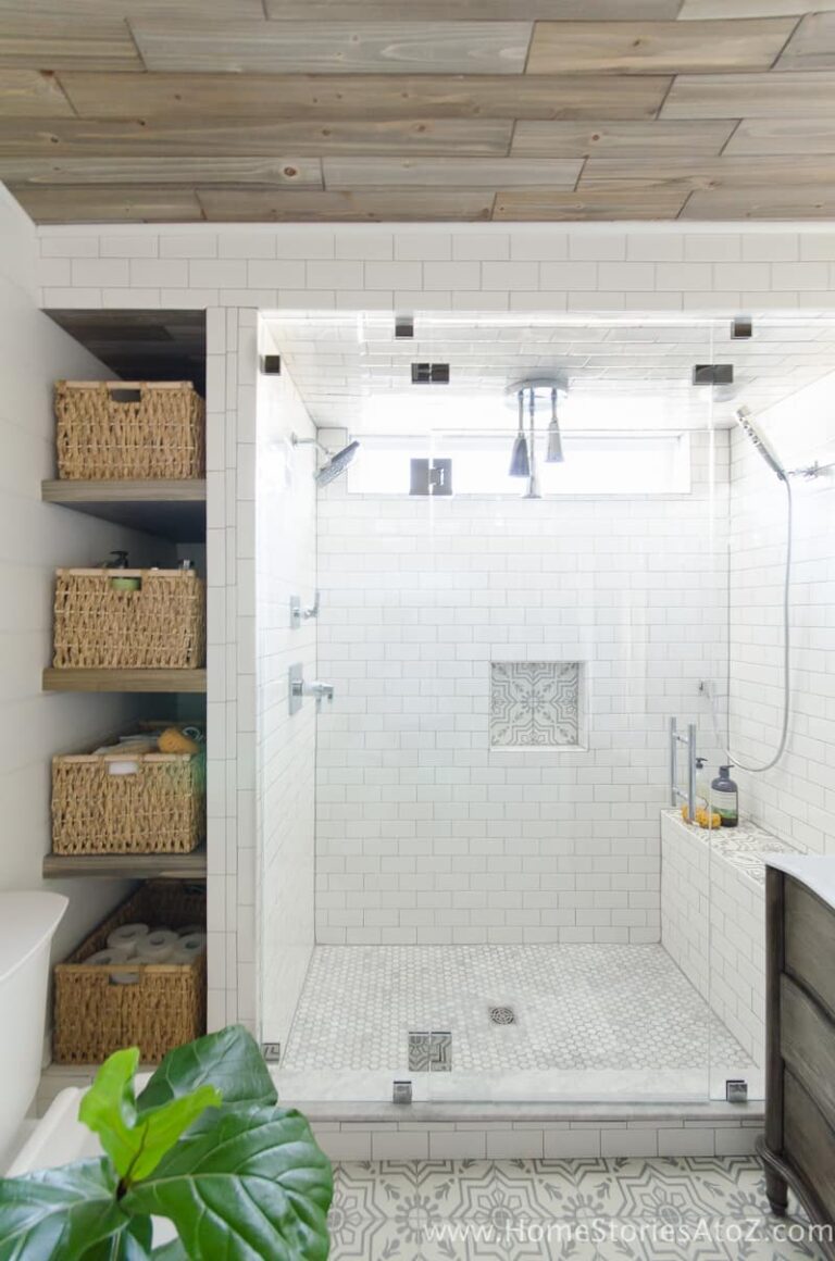
Modern Vintage Subway Tiled Walk-In Shower
I love this shower SO much!
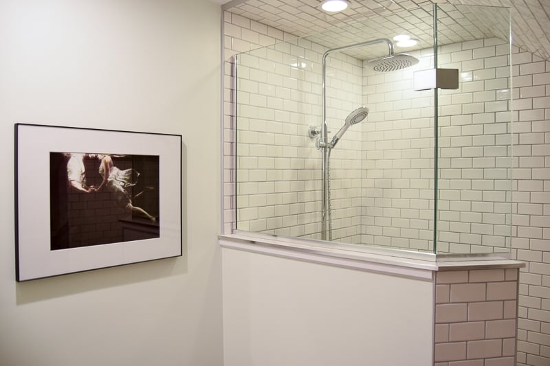
Ohh the rain shower head…..
The bench and aforementioned black penny tile…
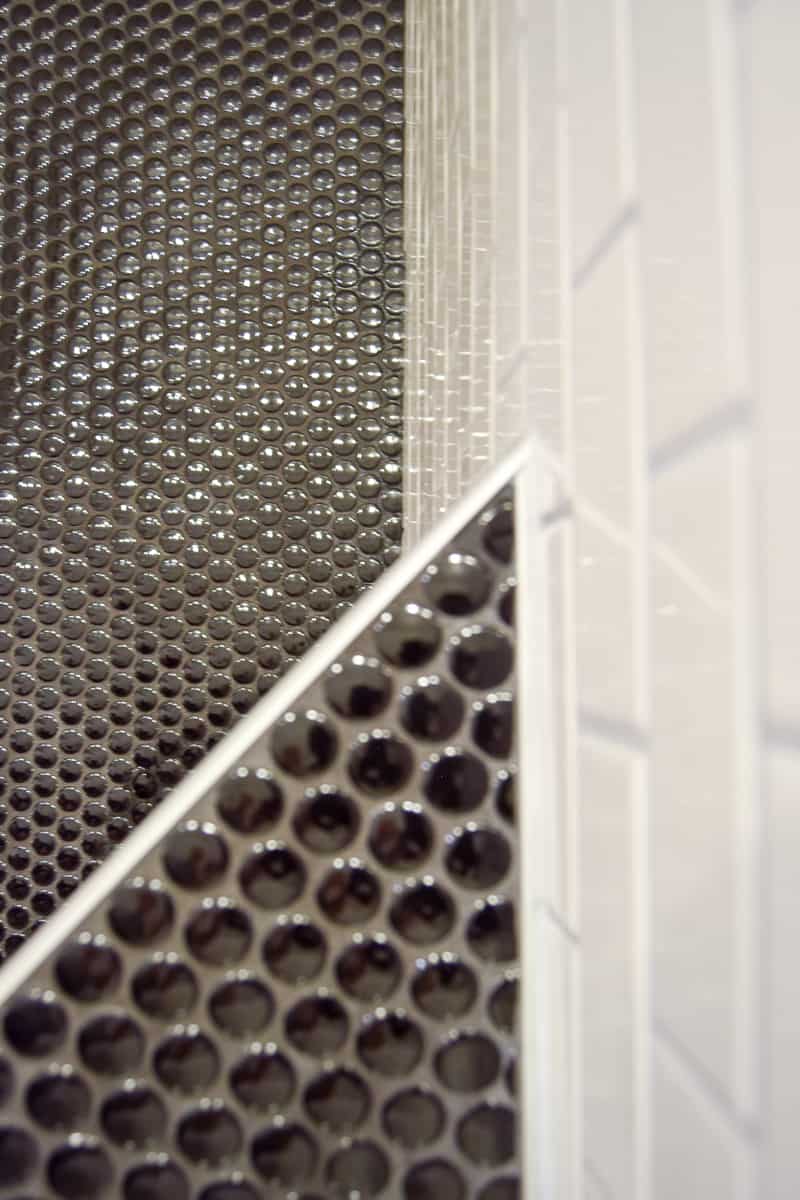
Sigh. It’s beautiful. My FIL did all of the tile work. While he’s not known for his speed (or ability to win bets), he did a fantastic job!
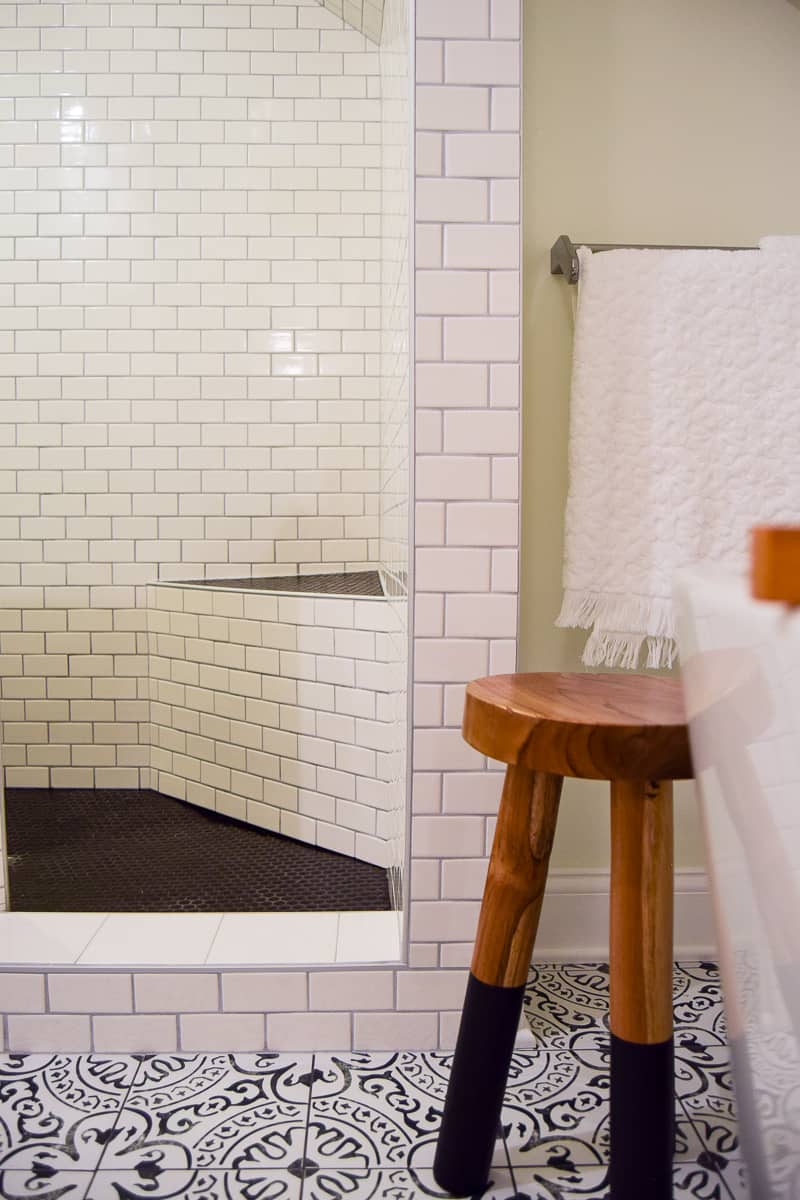
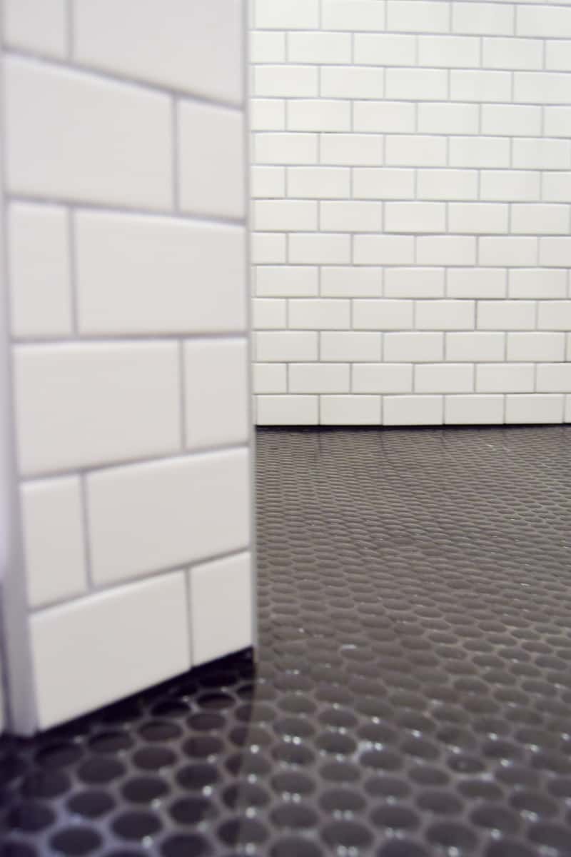
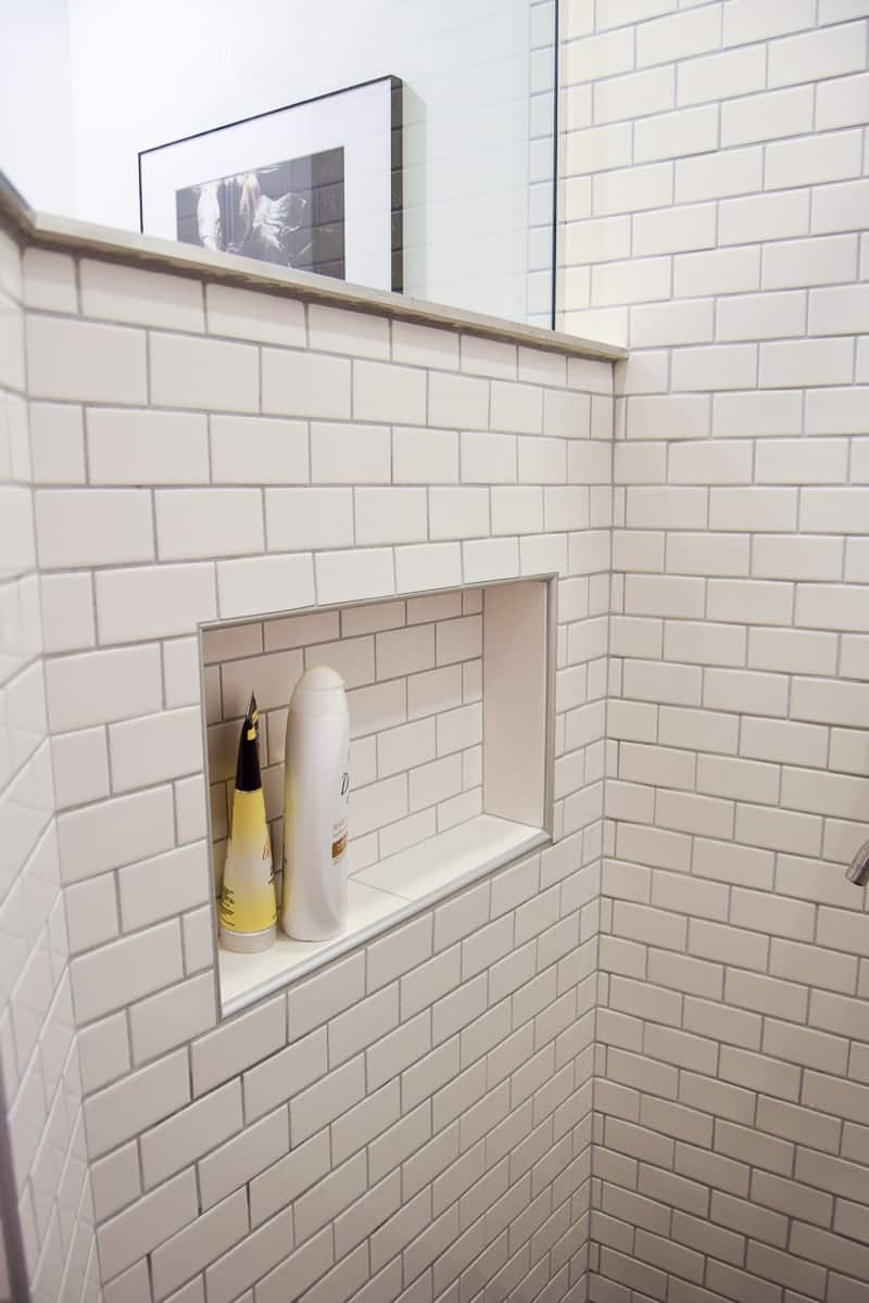
We had the glass custom-made to semi-enclose the shower. Even though the shower is open, the steam and warmth really stay in the shower with you.
I picked up that cute dip-dyed teak stool to set a towel on for your bath and/or shower.

Finishing Touches: Modern Vintage Bathroom Decor, Toilet Nook and Source List
Last but not least, the toilet 😉
No one cares about the toilet. But, I have to show it in order to show the most amazing art I found for the bathroom. It is SO perfect for the room and for life in general.
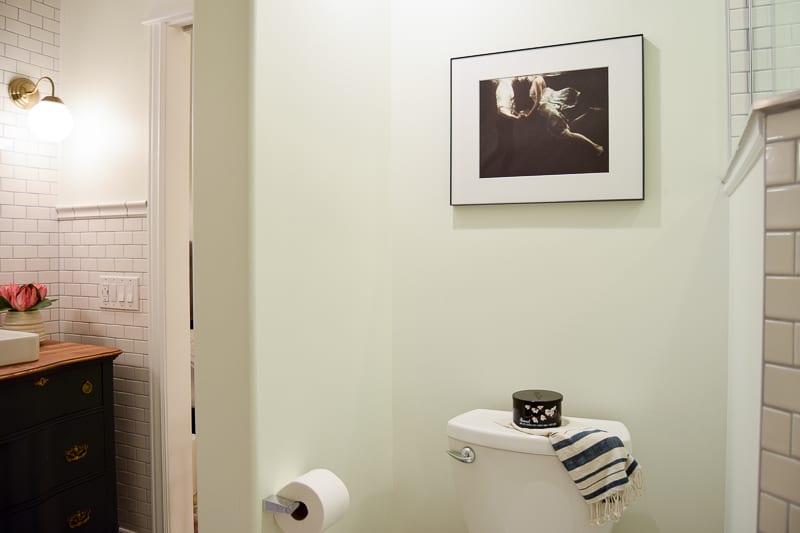
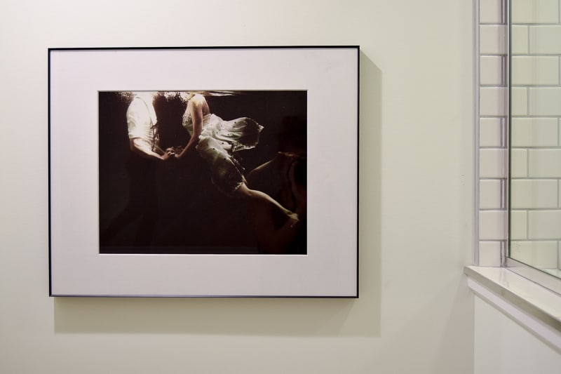
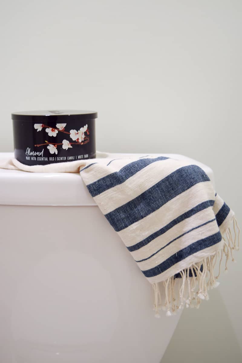
Sighhhhh. Isn’t it beautiful??
I’m very happy with how it turned out. And I never ever ever ever want to renovate a bathroom again 😉


Huge shout out to my husband for listening to me complain about the bathroom for a little 6 months and to my FIL for working tirelessly on everything.
I may have almost killed them both by the end and the feeling was mutual I’m sure. Renovations. Not for the faint of heart. (That should be my new blog title!)
Source List for Modern Vintage Bathroom
- Wall Paint Color Simply White by Benjamin Moore – Learn more about Simply White paint color here!
- Dresser turned Vanity – Found locally – Here’s kind of similar option to buy
- Dresser Paint Color Mount Etna by Sherwin Williams – Learn more about Mount Etna paint color here!
- Vessel sink
- Floor Tile – (also available online at Home Depot or on Amazon)
- Floor Grout
- Wall Subway Tile
- Wall Grout
- Black Penny Tile
- Showerhead, similar
- Bathtub
- Freestanding Chrome Bathtub Filler
- Dip-Dyed Stool
- Wall Mount Faucet, similar
- Wall Sconces, similar
- Mirror, similar
- Soap Tray, similar
- Waste Basket, similar
- Soap Dispenser, similar
- Wood Bowl with Lid, similar
- Towel Holder (on vanity), similar
- Faux Flowers, similar
- Vase, similar
- Embossed Tasseled Woven Bath Rug, similar
- Double Towel Bar, similar
- Picture Frame, similar
- Art (abyss of the disheartened VII by Heather Landis)
- Bathtub Caddy, similar
- Embossed Bath Towels, similar
- Hand Towel (on toilet back)
- Candle, similar
- Toilet
*This post was sponsored by American Standard. All thoughts and opinions are my own. Please see my full disclosure policy for more details*

PIN FOR LATER:



It’s beautiful!! Glad to see a post from you in my inbox today 🙂 And glad to hear you are loving your new home!!
Thanks, Lora 🙂 Feels good to be back.
hey girl- love the bathroom! so cool!
Thank you Shawna!!
So this email from WordPress shows up, then who the heck is Sarah?? (forgetting I had subscribed oh so long ago), so my attitude was skewed (read: slightly cranky) from the get-go. But you had me at Kenzzi Paloma. OMGosh!!! I’m not even in the market for tile!! No home projects goin’ on at all!! But did I order me up a sample tile?? Why yes I did. My discontent of kitchen and bathroom floors since moving in 1.5 years ago cane roaring to the forefront and now I CAN’T WAIT for that sample to arrive! Thanks?!? ?. Seriously, gorgeous bathroom! Well done!
HAHAHA!!! This is fantastic. I’m glad you like the tile. WhenI saw it I knew I had to have it. I hope you like your sample 🙂
Sarah! Absolutely stunning! And how nice to have a FIL who does tile! I can’t wait to see what you do with your interior design business!! ~Chelsea
Thank you so much Chelsea!! He’s kind of a jack-of-all-trades type person. I certainly miss living next to him.
Your bedroom is simply beautiful. Thanks for sharing such a detailed post with so many beautiful pictures. I have also updated my room recently. In order to add glow and coziness, I have placed Himalayan salt lamp in my room. This lamp is so beautiful and gives off such a beautiful glow. This lamp is made of Himalayan salt crystals and has meditative and therapeutic properties and makes the atmosphere pure and calms down the mind and body. It helps in relieving anxiety and depression and improve the sleep cycle. So, basically it is a complete decoration piece along with health benefits.
I am getting the same tile for my master bath, yours turned out so beautiful! Pinned
Thank you so much!! I absolutely love the tile and I’m sure it will look great in your master bath, too 🙂
Wow, absolutely stunning! I love the floor tile and the dresser is just perfect! great work!!
Thank you so much!!
Your redesign is beautiful! I’m looking for inspiration to “mix finishes” (I did it in 1995 and it was much easier because there were only two choices: chrome and brass. Based on your project, this is still the best!!!
One thing, you didn’t mention the sink, is it the AS-Vox? It looks like the one I selected for my guest bath and I absolutely love it!
Thank you!
Thanks so much! We used a Kohler vessel sink. This one is similar (affiliate link) – https://rstyle.me/+bOC1iByei_dQPhKNlnM5mw
Hi Sarah, Beautiful outcome! Love it. I am in the midst of all the planning for a refresh/remodel of my daughter’s bathroom. I’m glad to learn I am not the only one who became obsessed with finding the perfect tile… tile really is what dictates the theme of the whole room. And I also love the look of mixed finishes…Yours is the only blog that actually gives some direct pointers. Thanks! But…my question is about pocket doors…any comments on the process of adding the pocket door? I will be adding a very small one (25″) where there is currently an awkward regular door separating the toilet & shower from the sink vanity. I would really love to hear your tips/thoughts on the pocket door. If you and your husband have a kit you recommend, please let me know.
Hi, Anne! This is Sarah’s husband. I personally love love love pocket doors. I think they’re super-cool. When we installed our pocket door in the master bathroom we just went to home depot and bought the right size kit from the selection of exactly one type of kit they sold. It’s been a while now, though, so I’m not sure I have a name. I’ll see if I can find it and get back to you. It was super easy to install for us since we built the wall it was in from nothing. If you’re going to be modifying an existing wall to allow for a pocket door that gets a bit more complicated, as you’ll have to remove drywall and expand the current door opening to double the size of the door you’ll be installing. I hope this helps!
Love how your bathroom turned out. We are using this same tiles in our bathroom. What is the name of the grout color you used for your white subway tile?
Thanks for sharing such amazing ideas and beautiful pictures.